

Channelling Victor Hugo
Our Lady of Paris

It’s a pleasant walk through central Paris, from Rue des Feuillantines in the 5th Arrondissement to Rue de la Verrerie in the 4th. Victor Hugo wandered it often two hundred years ago and I’ve often wondered which path he took.
Perhaps he detoured through the Senate Gardens or stopped at a cafe in Sorbonne Quarter along the way. The one place he certainly did traverse is Île de la Cité -the heart of Paris and the soul of France.
Imagine his thoughts as he passed by the cathedral there, that featured so prominently in the novel for which he is most famous. I like to think tragedy and romance accompanied him on those walks, overshadowed by Gothic grandeur.
His destination was Jacques Herbin, the venerable ink maker. Founded in 1670 Herbin’s descendants had moved to the 4th Arrondissement under the patronage of Napoleon a couple of decades earlier. They made Victor Hugo’s ink.
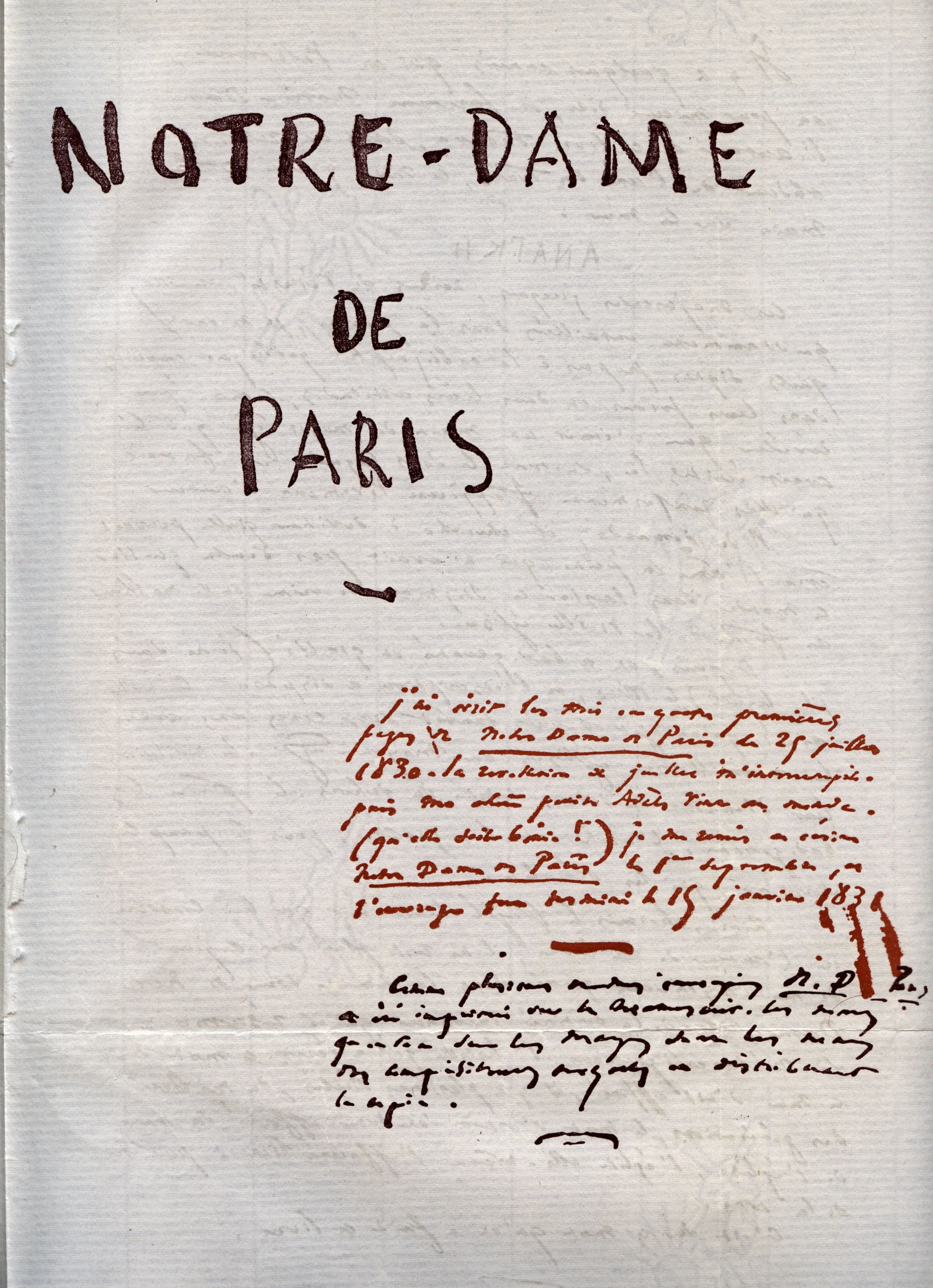
Victor Hugo’s ink was particular, a velvet black very different from the black Herbin manufactured for the French military and used by Napoleon himself. Despite efforts at preservation existing examples have lost their lustre.
And there will never be any new examples. J. Herbin made the ink exclusively for Victor Hugo, never selling it to anyone else, never making any of it after he died. The closest extant approximation is Perle Noire from Herbin’s modern collection so me being me, I decided to fake a Victor Hugo writing experience using it.
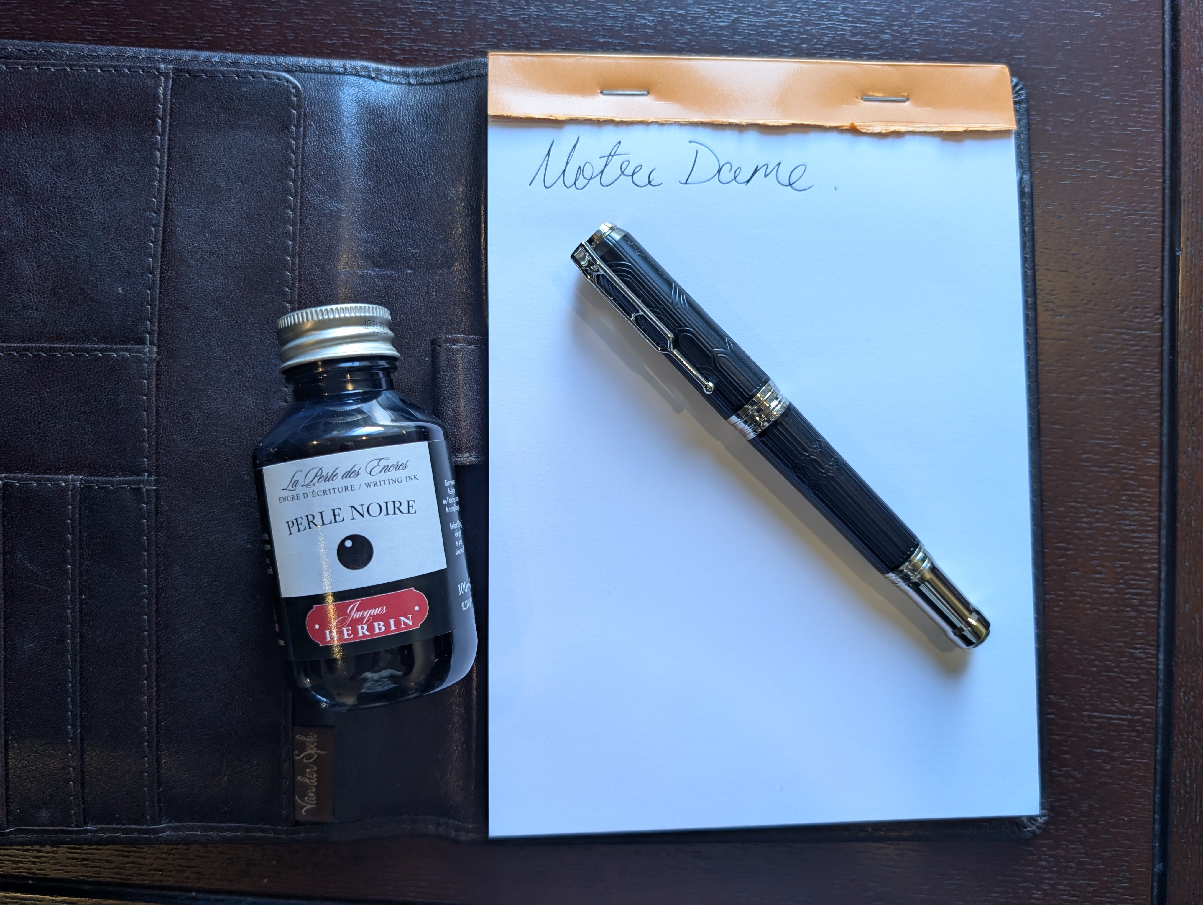
A few years ago Montblanc released the Homage to Victor Hugo fountain pen with a design inspired by the architecture of Notre Dame cathedral. Pictured here is a counterfeit of it.
Chinese counterfeits have come a long way, some are close enough to pass a cursory inspection and good pens in their own right. Counterfeits of Montblanc’s flagship Meisterstück range are particularly faithful so I decided to pay $70 to see how the crooks are getting on with Montblanc’s limited editions.
The answer is “not well.” The pen is a poor approximation with a blind cap over a cartridge-converter instead of a piston filler and the nib is a puny size #5, preposterous in relation to the rest of the pen. It’s nice to look at until you take the cap off, then it’s just an average writer. The pen won’t post which isn’t necessarily a bad thing as it’s so heavy.
The ink however, is beautiful. I think I’ve finally found the black ink I’ve been searching for. Perhaps one day I’ll contemplate a novel at a cafe on the bank of the Seine, and doodle my thoughts with it. Loaded into a better pen.
-SRA. Auckland, 20/x 2025.
OK I get it now. I have graduated to Pen College!
Oh I feel so honored Simon.
Thank You